Behind the Scenes: Designing Our New UI
Get the inside take on why and how we updated Modern Treasury’s UI.
Modern Treasury’s suite of APIs are the backbone of our operating system for money movement. It follows that, since our founding, product resources have been largely dedicated to ensuring these APIs are impeccable. In terms of the UI, product designers have worked to translate API functionality into a mirrored dashboard experience. Recently, we’ve dug deeper into what this “mirroring” should entail—a 1:1 rendering of API data in dashboard form or a parallel (but distinct) persona-driven UI experience?
Early Modern Treasury customers relied more on APIs than the UI. As we’ve begun serving more enterprises, usage has shifted. Finance leadership at large companies tends to use the dashboard as much, if not more, than APIs—these roles also expect greater functionality within the UI.
The evolution in who uses Modern Treasury has coincided with product milestones. In light of these shifts, we recently shipped a refreshed UI. Read on to discover how we planned and executed the update, how users will benefit, and what’s next.
The New UI: Project and Principles
Reimagining our UI centered around two primary questions:
- What are the jobs to be done when users pull up Modern Treasury?
- What do users need to either get access to quickly or get an immediate sense of and then dive deeper?
This project aimed to create a high-value interface that helps users increase efficiency and save time with improved visibility and workflows. In approaching these questions, our product design team had to ensure the outcome was:
1. Workflow-centric. Grounding decisions in jobs-to-be-done helps guarantee that user experience is catered to the appropriate persona—finance and operations, for example, vs. engineering. Without this focus on workflows, using the dashboard could feel disparate or disjointed; our goal was for the UI to feel intuitive, driving customers toward natural paths to accomplish their daily goals.
2. Clear, streamlined, and comprehensive. Users rely on the clarity of Modern Treasury’s platform and they look to accomplish tasks in as few clicks as possible. A high level of data accuracy is also key. For this reason, the dashboard doesn’t round down or truncate data—information is shown as explicitly and granularly as possible. Especially considering how the front-end parallels the API, we aim to be as respectful as possible to the data coming in. This accuracy and comprehensiveness results in a “single pane of glass,” a reliable, centralized operating system for finance.
3. Customer-informed. Customer interviews, demos, and feedback have been essential to improving the UI. What’s so interesting about talking with customers is that finance operations (and associated roles) can be very different from company to company. There's always something to be learned from each customer's use case as we work to find the right baseline for a wide variety of users.
Key Upgrades
Updates to the customer dashboard, navigation, and reconciliation product provide a great example of these principles in action. At scale, the UI now enables customers to take fine-tuned action on specific payments, as well as tasks related to ledgers and reconciliation.
Dashboard
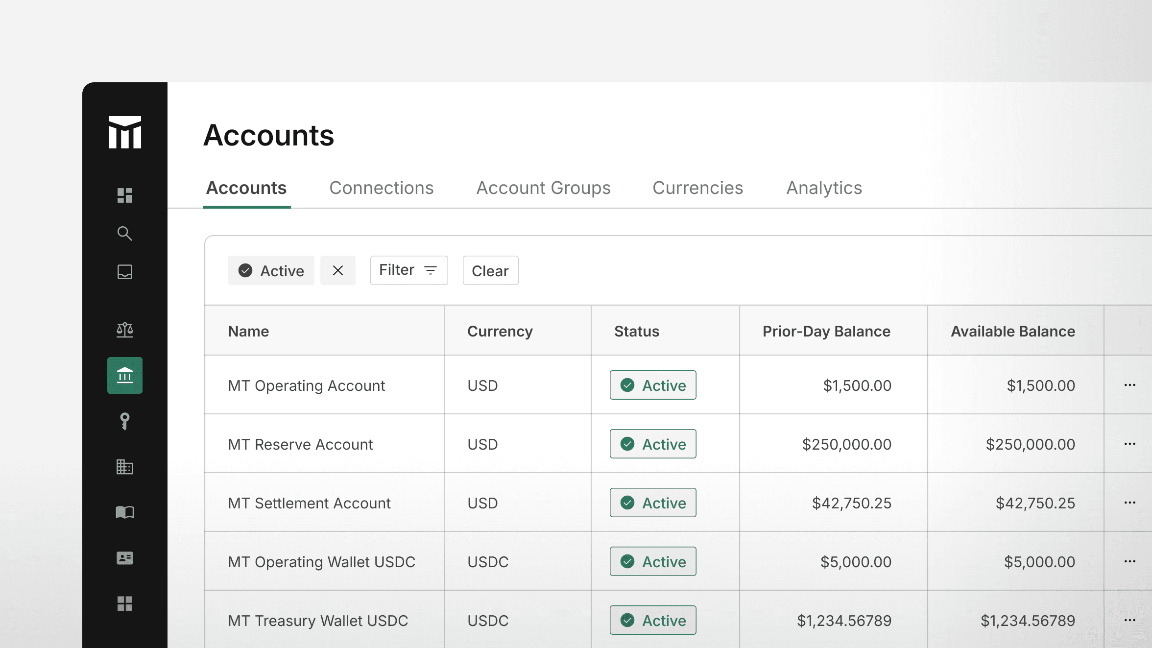
Early iterations of Modern Treasury’s dashboard prioritized resources and a handful of tasks. Users could see Balances, Reconciled volumes, Approvals, and Metrics (showing inflows, outflows, and book transfers for a selected period). What was displayed after a user logged in wasn’t especially helpful in terms of understanding cash flow or jobs to be done.
The new dashboard offers visibility into key data at a high level and the ability to drill down and learn more. New widgets facilitate this:
- Balances give users a near real time view of company money
- Bank Accounts allow users to see all banks in one place
- Reconciliation Stats provide an overview and link to a user’s next recon task
- Payment Alerts show total amount of payments and prompt jobs-to-be-done
Payment Alerts are a good example of opportunities for drilling down. Users can filter payment orders and easily understand what those alerts are for a specific time range. They can also drill into returns from the dashboard as well to begin addressing them.
Customers can see Cash Flow (inflows and outflows), Cash Flow Metrics (payments, charges, and transfers), and ACH return rate (to monitor against Nacha limits).
Navigation
The dashboard’s side navigation has been expanded in support of jobs-to-be-done. Approvals are now flagged in the top left corner so finance and operations team members can immediately work through payments that require approval. New top-level objects, including access to Reconciliation, Accounts, and Counterparties, make workflows across Modern Treasury products simpler to begin.
Customers can also navigate our app using ⌘K (or Ctrl+K on Windows)—a feature we’re calling Quickswitch. With this shortcut (or clicking on Quick Search at the top of the side navigation) users will be presented with a window where they can find specific objects within the app, or create new objects.
Reconciliation
Reconciled Volume in the early UI got very little usage, perhaps because it wasn’t directly linked to an actionable workflow. Previously, to dig deeper into reconciliation required going into each specific account to work through transactions. Now, Reconciliation is its own section in the nav.
The new UI makes it simple and fast for users to see a high-level overview, work through unreconciled payments one by one, and powerfully customize their reconciliation flows.
Insights
On the reconciliation/insights page, users can see a quick snapshot of unreconciled transactions across accounts, which serves as a jumping off point to manage exceptions.
Reconcile
Using the reconciliation/reconcile tab, customers can leverage a side-by-side view of their Reconciliation page and associated Expected Payments, making it easy to work through transactions one by one. Modern Treasury’s matching engine reconciles up to 95% automatically—this page helps users get to 100%, even for complex matching like one to many and many to one.
Reconciliation Rules
Reconciliation Rules allows users to customize our reconciliation engine to fit their specific fund flows and data nuances. The engine supports both received payments and payments originated outside of Modern Treasury.
The ability to generate rules easily in the UI with detailed filters and operators is incredibly powerful, especially for enterprises with a high volume of transactions. Creating a set of rules to run sequentially means teams can be more effective about transactions coming in, and automated reconciliation means less work for individuals handling exceptions.
Reconciliation Rules are also a great example of customer feedback taken to heart. By default, rules are displayed in human language, as opposed to JSON. While JSON is available, it’s more likely that a finance persona would be creating a rule and prefer human language over code.
What’s Next
This release was the first in a series of exciting updates to the UI. Future improvements will include additional ways to drill into specific data, new advanced filters, and user customizations to the dashboard.
From our updated UI to one-of-a-kind APIs, Modern Treasury is the operating system for enterprise-level money movement. Reach out to learn more.
Get the latest articles, guides, and insights delivered to your inbox.
Authors